USA Investment Analysis with R
Contribution to #TidyTuesday, week 33
It’s been a long time since I’ve participated in #TidyTuesday: a bit due to lack of time, a bit because the datasets they published didn’t motivate me, and a bit because I was embarrassed to always upload the same thing. But today, after having dedicated three hours of my Sunday to Kierisi’s livestream on Machine Learning, I wanted to continue programming.
(For those who don’t know: #TidyTuesday is a collaborative project that consists of working every week with a set of real data to practice visualization and other skills in the world of data science. You can find more information in its GitHub repository and under the hashtag on twitter.)
Let’s start with the general organization:
library(tidytuesdayR)
library(tidyverse)
library(hrbrthemes)
library(streamgraph)
library(htmlwidgets)
library(webshot)

tuesdata <- tidytuesdayR::tt_load('2021-08-10')
##
## Downloading file 1 of 3: `ipd.csv`
## Downloading file 2 of 3: `chain_investment.csv`
## Downloading file 3 of 3: `investment.csv`investment <- tuesdata$investment
chain_investment <- tuesdata$chain_investment
ipd <- tuesdata$ipd
# Exploratory Analysis ----------------------------------------------------
glimpse(investment)## Rows: 6,106
## Columns: 5
## $ category <chr> "Total basic infrastructure", "Total basic infrastructure", …
## $ meta_cat <chr> "Total infrastructure", "Total infrastructure", "Total infra…
## $ group_num <dbl> 1, 1, 1, 1, 1, 1, 1, 1, 1, 1, 1, 1, 1, 1, 1, 1, 1, 1, 1, 1, …
## $ year <dbl> 1947, 1948, 1949, 1950, 1951, 1952, 1953, 1954, 1955, 1956, …
## $ gross_inv <dbl> 4974.662, 6486.770, 7376.143, 7943.959, 8961.233, 9707.590, …glimpse(chain_investment) # how much did it change with time## Rows: 6,035
## Columns: 5
## $ category <chr> "Total basic infrastructure", "Total basic infrastruct…
## $ meta_cat <chr> "Total infrastructure", "Total infrastructure", "Total…
## $ group_num <dbl> 1, 1, 1, 1, 1, 1, 1, 1, 1, 1, 1, 1, 1, 1, 1, 1, 1, 1, …
## $ year <dbl> 1947, 1948, 1949, 1950, 1951, 1952, 1953, 1954, 1955, …
## $ gross_inv_chain <dbl> 73278.62, 83218.25, 95760.00, 103642.40, 102264.39, 10…glimpse(ipd)## Rows: 6,106
## Columns: 5
## $ category <chr> "GDP", "GDP", "GDP", "GDP", "GDP", "GDP", "GDP", "GDP", …
## $ meta_cat <chr> "GDP", "GDP", "GDP", "GDP", "GDP", "GDP", "GDP", "GDP", …
## $ group_num <dbl> 0, 0, 0, 0, 0, 0, 0, 0, 0, 0, 0, 0, 0, 0, 0, 0, 0, 0, 0,…
## $ year <dbl> 1947, 1948, 1949, 1950, 1951, 1952, 1953, 1954, 1955, 19…
## $ gross_inv_ipd <dbl> 12.250, 12.946, 12.942, 13.064, 13.950, 14.254, 14.436, …investment %>% group_by(category) %>% count()## # A tibble: 60 × 2
## # Groups: category [60]
## category n
## <chr> <int>
## 1 Air transportation 71
## 2 All federal 71
## 3 Conservation and development 71
## 4 Education 71
## 5 Federal 639
## 6 Federal electric power structures 71
## 7 Health 71
## 8 Highways and streets 71
## 9 Office buildings, NAICS 518 and 519 71
## 10 Other federal 71
## # ℹ 50 more rowsinvestment %>% group_by(meta_cat) %>% count()## # A tibble: 16 × 2
## # Groups: meta_cat [16]
## meta_cat n
## <chr> <int>
## 1 Air /water /other transportation 852
## 2 Conservation and development 213
## 3 Digital 355
## 4 Education 426
## 5 Electric power 426
## 6 Health 497
## 7 Highways and streets 142
## 8 Natural gas /petroleum power 213
## 9 Power 213
## 10 Public safety 355
## 11 Sewer and waste 142
## 12 Social 426
## 13 Total basic infrastructure 568
## 14 Total infrastructure 426
## 15 Transportation 710
## 16 Water supply 142This week’s dataset was about investments in the US during the period of time that goes from 1947 to 2017. I have to confess that I wasn’t very motivated by the topic either; in addition, the three dataframes that they brought were very similar and with some terminology about economics that I did not fully understand. But it did feel like doing something, and that was enough.
I decided not to procrastinate too much and make at least two charts on some familiar field, so I chose education.
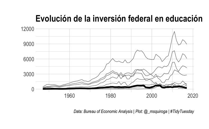
First question: How has federal investment in education changed over this time period?
This was, let’s say, the well-known and easy graph: I chose a line graph to show the evolution of the investment and I chose a single topic to innovate: leave the other values of the categorical variable “investment areas” in gray, and highlight only the area of education.
investment %>%
  filter(category=="Federal") %>%
  mutate(highligth = ifelse(meta_cat=="Education", "Education", "Other")) %>%
  group_by(meta_cat, year) %>%
  ggplot(aes(x = year, y = gross_inv, group = meta_cat, size = highligth))+
  geom_line()+
  scale_color_manual(values = c("#69b3a2", "lightgrey"))+
  scale_size_manual(values=c(1.5,0.2))+
  theme_ipsum()+
  theme(legend.position = "none")+
  labs(x="", y="",
       title="Evolution of Federal Investment in Education",
       caption = "Data: Bureau of Economic Analysis | Plot: @_msquiroga | #TidyTuesday")
## Warning: Using `size` aesthetic for lines was deprecated in ggplot2 3.4.0.
## ℹ Please use `linewidth` instead.
## This warning is displayed once every 8 hours.
## Call `lifecycle::last_lifecycle_warnings()` to see where this warning was
## generated.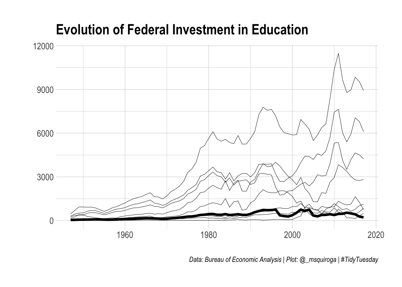
I am quite satisfied with the result. In general, I tend to prefer colorful graphics with a lot of information, but that’s why they end up being confusing and with overlapping information. Instead, this graph seemed clear and with a sober design.
Second question: how have the different sources of investment evolved over time?
I first thought of making a chart similar to the one above: a stacked area chart. But looking at R Graph Gallery, one of the best visualization resources out there, I thought it might be a good idea to try the StreamGraph package to make, well, interactive “stream” graphs. In general, I am not very fond of using other packages than ggplot2, not because I am a fundamentalist, but only because it is what I use the most. But hey, you have to innovate.
graph <- investment %>%
  filter(meta_cat == "Education") %>%
  streamgraph(., key = "category", value = "gross_inv", date="year") %>%
  sg_legend(TRUE, "Fuente de inversión")
graph
The fact that the result was an html and not an image was a bit problematic for me: I couldn’t share it on twitter with its interactive version. But luckily here it is (and by the way I read a little more about widgets in the book RMarkdown: The definitive guide).
To improve:
The steamgraph looks very nice, but it’s a bit unclear (in fact, what you see in the first graph, which is federal spending, is barely visible in the second). That is, disproportionate amounts should be able to look the same, despite being disproportionate. On the other hand, the selector box disappeared here, in RMarkdown, even though I see it fine in the widget I download. I have no idea what it is due to.
As always, remember you can suscribe to my blog to stay updated, and if you have any questions, don’t hesitate to contact me. And if you like what I do, you can buy me a cafecito from Argentina or a kofi.
Macarena Quiroga
Linguist/PhD student
I research language acquisition. I’m looking to deepen my knowledge of statistis and data science with R/Rstudio. If you like what I do, you can buy me a coffee from Argentina, or a kofi from other countries. Suscribe to my blog here.