StarTrek voice commands
Contribution to #TidyTuesday week 34
Two weeks in a row! Kudos for me! I’ve decided that I’ll try to participate every week in #TidyTuesday, even if it’s a single graph. What matters to me is to keep up practizing and to find a new topic to explore each week.
(For those who haven’t met them: #TidyTuesday is a collaborative project which consists in working each week with a new real data set, to practice visualization skills and such. You can find more about it in their GitHub repo and under the Twitter hashtag.)
This week dataset has the voice commands used by StarTrek characters. I know this must have been a great opportunity to practice text analysis; I, ironically, still haven’t learned how to do it. Worse, I haven’t even seen StarTrek, so I didn’t have background to understand how to really make the most of it.
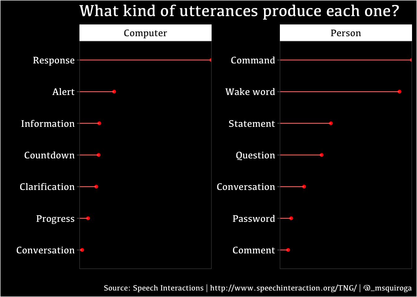
So, to be faithful to my goal, I’ve decided to create a modest graph: counting how many utterances were madre, organizing them by type of utterance and dividing them by character type (person or computer). Then, I thought what kind of modifications I could add. Understanding the functioning of theme() has always been a great challenge for me; I tend to chose a theme and then stick with the default options, because I don’t have a lot of visual skills.
So, what have I learned this week?
I did a lollipop chart; even though I had already used them before, this time I took the time to read more about them. I learned that some people think that the increase of visual attractiveness that the chart provides, actually decreases their precision (because the circle in the point of the line is more imprecise than the strict line of a bar).
I did modify a lot of the theme’s component: I learned that the chart’s background color and the image background color are different objects. I changed the font and it’s size; I reinforced the functioning of the faceted graph labels.
I learned about the
tidytext::reorder_within()function, that was first mentioned in this Tyler Rinker blogpost, and then added to thetidytextpackage (in this Julia Silge post you can find a more detailed explanation of the process). But, as with great power comes great responsability, this function duplicated all the factors labels (who knows why), so I had to edit them… by hand. Whatever.
The code
library(tidyverse)
library(tidytext)
library(ggthemes)

tuesdata <- tidytuesdayR::tt_load(2021, week = 34)
##
## Downloading file 1 of 1: `computer.csv`computer <- tuesdata$computer
computer <- computer %>%
mutate_all(.funs = tolower) %>% # to unify rows
mutate_if(is.character, as.factor)
computer$char_type <- factor(computer$char_type, levels = c("computer", "person"),
labels = c("Computer", "Person")) # arrange
computer %>%
group_by(char_type, type) %>%
summarise(count = n()) %>% # command quantity
mutate(type = reorder_within(type, count, char_type)) %>% # arranged by size
ggplot(aes(x=reorder(type, count), y = count))+
geom_point(color = "red")+
geom_segment(aes(x=reorder(type, count), xend =type, y=0, yend=count, color = "red"))+
facet_wrap(~char_type,
scales = "free", # to prevent blank spots
labeller = labeller( # facet title
Computer = computer,
Person = person))+
coord_flip()+
scale_y_reordered()+ # rearrange elements within the facet
scale_x_discrete(labels = c("response___Computer" = "Response",
"alert___Computer" = "Alert",
"info___Computer" = "Information",
"countdown___Computer" = "Countdown",
"clarification___Computer" = "Clarification",
"progress___Computer" = "Progress",
"conversation___Computer" = "Conversation",
"command___Person" = "Command",
"wake word___Person" = "Wake word",
"statement___Person" = "Statement",
"question___Person" = "Question",
"conversation___Person" = "Conversation",
"password___Person" = "Password",
"comment___Person" = "Comment"))+
theme_few()+
theme(plot.background = element_rect(fill = "black"), # image background
panel.background = element_rect(fill = "black"), # chart background
axis.text = element_text(color = "white", size = 12), # axis text
plot.title = element_text(color = "white",
size = 20), # chart title
plot.caption = element_text(color = "white"), # font
legend.position = "none", # remove reference
text = element_text(family = "Kefa"), # chart font
panel.grid.major.x = element_line(size = 4), # shrink space between ticks
strip.text = element_text(size = 12) # facet title font size
)+
labs(x = "", y = "",
title = "What kind of utterances produce each one?",
caption = "Source: Speech Interactions | http://www.speechinteraction.org/TNG/ | @_msquiroga"
)
I hope you find this useful. Let me know!
As always, remember you can suscribe to my blog to stay updated, and if you have any questions, don’t hesitate to contact me. And if you like what I do, you can buy me a cafecito from Argentina or a kofi.
Macarena Quiroga
Linguist/PhD student
I research language acquisition. I’m looking to deepen my knowledge of statistis and data science with R/Rstudio. If you like what I do, you can buy me a coffee from Argentina, or a kofi from other countries. Suscribe to my blog here.