Help! How do I do a plot in R?
Visualizing data easily in R and RStudio: A simple guide using the plot() function

Welcome to the third publication of the saga Help! I have quantitative data, and now what do I do? Aimed at all those people who have to start carrying out statistical analysis and have never done anything other than a schedule grid in Excel. In the first post we saw how to install R and RStudio, how to load the data, and how to inspect roughly our table. Then, in the second post we saw how to calculate the mean, median, and the mode in R, how to do those calculations differentiating between groups and what to do if I have missing data.
In this post we are going to start to see how to make graphs with R. As I mentioned in the previous post, in this saga we are going to try to use only base R functions, without resorting to other packages. There are many packages that provide powerful visualization tools (hello, ggplot2), but the goal of these posts is to try to solve your life, not complicate it. You may not achieve the most beautiful and bombastic graphics in the universe, but you will have clear and precise visualizations to understand your data a little more, to share with your team and also to publish in scientific journals. Let us begin!
First step: the data
As you will remember from the previous posts, the first thing we have to do is load the data. In this case we are working with a penguin data table provided by the palmerpenguins package. If you never installed it, run these commands; if you already installed it, only the second and third (reminder: to execute a command, place the cursor on that line and press control+enter or click Run in the upper right corner of the script pane; if you don’t remember What is all this, check the first post).
install.packages("datos")
library(palmerpenguins)
penguins <- palmerpenguins::penguins
In the second post we had calculated three important measures of basic descriptive statistics: mean, median and mode. These three values helped us to begin to understand how the data behaved, both in general terms (for example, the length of the beak) and in subgroups (differences by sex in the length of the beak). Presenting information graphically helps us understand the differences or similarities.
Second step: automatic visualizations with plot()
One of the basic functions that allows us to visualize the data is plot(), which without further ado plots the data that we pass as an argument depending on the type of data it is. The advantage is that we don’t need to think much: we choose the variable we want to see and the function will decide by itself which graph is more convenient. For example, if I’m interested in the island where the penguins come from, I can run the following command:
plot(penguins$island)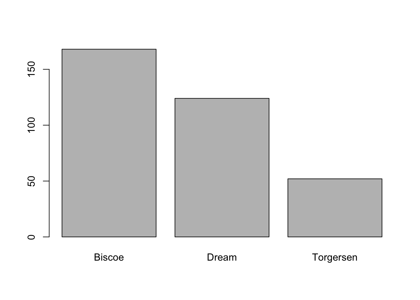
# the $ sign is used to select a column within the table or dataframeSince the variable island is categorical (i.e., the values it can take are names or classifications that differentiate between groups), we got a bar chart that counts numbers of penguins by island. On the x-axis (horizontal) we have the names of the islands and on the y-axis (vertical) we have the number of little penguins (or observations) on each one.
On the other hand, if we pass a numeric variable, such as the length of the beak, as an argument, we see that the result is very different:
plot(penguins$bill_length_mm)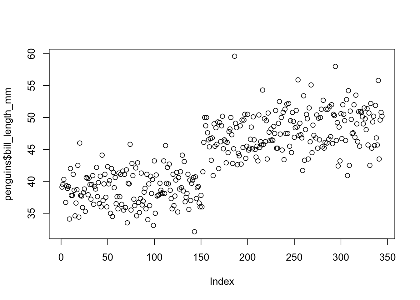
This is called a scatterplot and is a type of graph that shows the correlation between two numerical variables. I imagine you’re thinking: how two variables, if I gave it only one? and you’re right, but look at what appears on the x-axis: Index. The value of index (or index, in Spanish) refers to the number of observations. So each dot on the graph represents a penguin. This graph shows us that there appear to be two large groups: one with a rather short beak (the one on the left) and another with a rather long beak (the one on the right). However, this doesn’t seem to be the clearest or at least the most useful plot, because we don’t know what order the data is in (ie, what’s the difference between 1 and 350). But as a first step, it’s fine.
The scatterplot makes more sense when you choose two actual numerical variables, such as beak length and beak height.
plot(penguins$bill_length_mm, penguins$bill_depth_mm)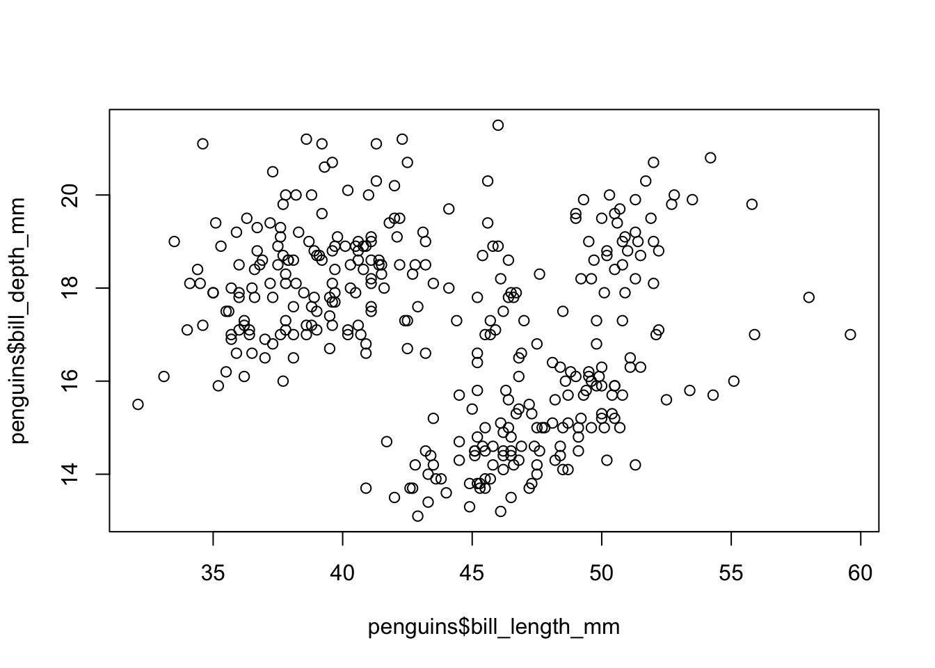
# arguments inside a function are always separated by a commaThis graph, although it seems not to be as clear as the previous one, makes more sense from the theory: each point marks the correlation between the length and the height of the beak of the penguins. In any case, you begin to notice that there are groups, that is, you see certain point clouds that seem to be grouped based on some subdivision that we still don’t know. What we can do is think: what variable could separate these clouds? There are three categorical options: the sex and species of the penguins, and the island of origin. So, if we want to see how these variables are related, we can make each point a different color depending on, for example, gender:
plot(penguins$bill_length_mm, penguins$bill_depth_mm, col = penguins$sex)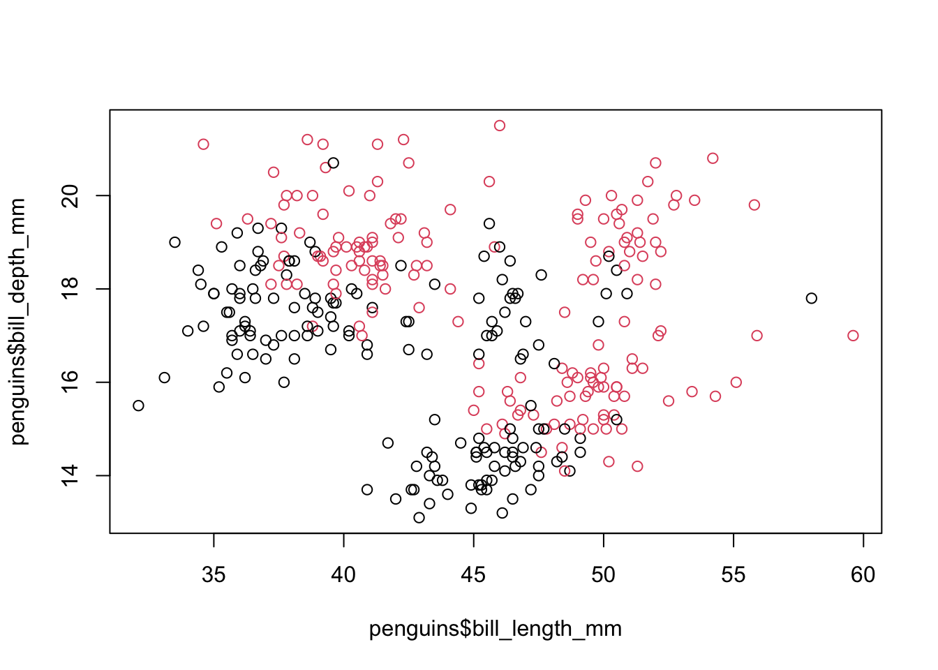
The col argument specifies the grouping variable by which each of the points will to be colored. Keep in mind that this variable has to be categorical, not numeric, in order to allow the division into groups. Finally, notice that the three arguments that appear in the function follow the same syntax: table$column.
So we see that there is a certain pattern in the relationship between the height and the length of the beak, but as the graph stands we don’t know which points are the male penguins and which are the females. The reference table in R is called legend and can be added to a graph with an extra function. While we’re at it, let’s specify within the function that we’ve been using slightly friendlier names for the axes, called labels:
plot(penguins$bill_length_mm, penguins$bill_depth_mm,
      col = penguins$sex,
      xlab = "Length of the beak (mm)",
      ylab = "Peak height (mm)")
legend("topright", legend = unique(penguins$sex),
        col = unique(penguins$sex), pch = 19)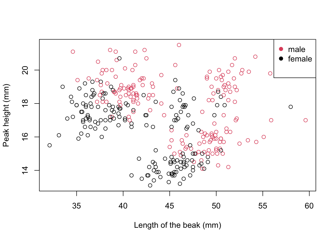
Keep in mind that they are two different functions (plot() and legend()), so you need to run each one separately. The second one is added on top of the previous graph, therefore if you want to make a change in the graph you should run it all over again.
Now, let’s take a closer look at that second function. The first argument is the position of the box and can take the following values: “bottomright” (bottom right), “bottom” (bottom center), “bottomleft” (bottom left), “left” (left to center), “topleft” (top left), “top” (top center), “topright” (top right), “right” (right center) and “center” (center of the square).
The second argument specifies the text of the reference box (ie each item). Here you have two options: the one we did here was to specify the grouping variable; we had to specify it to take the unique values of that variable with the unique() function, otherwise it will make a list with the value of each of the points (you can test what would happen if you remove that part). The other option is to specify by hand: legend = c("male", "female"). Since we have two values, we have to concatenate them and this is done with the c() function, which is marking a set of elements. This alternative is good if for some reason you have to change the text (suppose you had M and H in the column but you still want the words “male” and “female” in the graphic); the downside is that if you put the names in the reverse order that they are encoded, you can invert the colors. To check the order of the groups, you can execute the following command in the console: levels(penguins$sex) and it will indicate the levels of that variable.
The third argument is similar to the previous one, but to define the colors of the graph. What we did was tell it: “use a different color for each of the values of this variable”, but we could have indicated two colors, for example cols = c("blue", "green") (the list of You can find colors of base R at this link).
Finally, the argument pch or plotting character indicates the symbol to use. R base offers several different symbols:
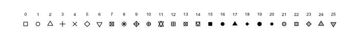
In general, the most used symbol is 19, the circle; in cases where it is necessary to mark other differences, the triangle (17) can be used, but these are rare cases.
There are more visual details that can be added, such as a title or caption; you can read more about re this in the official documentation.
Third step: save the images
Once you feel satisfied with the image you have created, you have several alternatives to download it. The easiest option is to go to the bottom-right panel, click Export, then select Save as image, and you’re done. You can also make copypaste of the image in the document you need.
However, sometimes magazines are a bit picky about images and ask for them to be of a certain quality or a certain size. In those cases, you can use the png() or jpg() function with whatever specifications you need.
png("test2.png", res = 150, width = 1000, height = 500, units = "px")
plot(penguins$bill_length_mm, penguins$bill_depth_mm,
      col = penguins$sex,
      xlab = "Length of the beak (mm)",
      ylab = "Peak height (mm)")
legend("topright", legend = unique(penguins$sex),
        col = unique(penguins$sex), pch = 19)
dev.off()
The order is as follows: first, execute the function that indicates the specifications of the graph that we want to create, then we execute the function(s) of the graph itself (in this case we have two: the graph and the superimposed reference box) and finally we need to shut down the process with dev.off(), a function that tells R that the graphics processor is ready to kill.
Closing
In this post we saw a first approach to how to make graphs in R. We concentrated on a single function, plot(), which, although it is not the most visually attractive, has a lot going for it. In the next post, we will explore different types of graphs that are suitable for various situations.
As always, remember you can suscribe to my blog to stay updated, and if you have any questions, don’t hesitate to contact me. And if you like what I do, you can buy me a cafecito from Argentina or a kofi.
Macarena Quiroga
Linguist/PhD student
I research language acquisition. I’m looking to deepen my knowledge of statistis and data science with R/Rstudio. If you like what I do, you can buy me a coffee from Argentina, or a kofi from other countries. Suscribe to my blog here.