How to Choose a Chart Type Based on Research Questions
 Image created by me using the {aRtsy} package
Charts or visualizations are an essential part of any scientific article or work report. They allow us to visually organize information for a more holistic understanding. However, many times, we put the cart before the horse and create a chart just because we like it, it’s trendy, or worse, someone told us to do it, without considering if that chart type is ideal for conveying our message.
In this post, we will analyze different research questions that can arise from a dataset and identify the ideal charts to visualize that information. While there will be code, this is not a technical post; we’ll save that for another time.
The Dataset
We will work with the Extramarital affairs dataset, which is a study conducted in 1969, available on Kaggle. Once we have loaded the dataset, the first thing we do is inspect the variables:
library(tidyverse)
glimpse(affairs)
## Rows: 601
## Columns: 10
## $ ...1 <dbl> 4, 5, 11, 16, 23, 29, 44, 45, 47, 49, 50, 55, 64, 80, 86…
## $ affairs <dbl> 0, 0, 0, 0, 0, 0, 0, 0, 0, 0, 0, 0, 0, 0, 0, 0, 0, 0, 0,…
## $ gender <chr> "male", "female", "female", "male", "male", "female", "f…
## $ age <dbl> 37, 27, 32, 57, 22, 32, 22, 57, 32, 22, 37, 27, 47, 22, …
## $ yearsmarried <dbl> 10.00, 4.00, 15.00, 15.00, 0.75, 1.50, 0.75, 15.00, 15.0…
## $ children <chr> "no", "no", "yes", "yes", "no", "no", "no", "yes", "yes"…
## $ religiousness <dbl> 3, 4, 1, 5, 2, 2, 2, 2, 4, 4, 2, 4, 5, 2, 4, 1, 2, 3, 2,…
## $ education <dbl> 18, 14, 12, 18, 17, 17, 12, 14, 16, 14, 20, 18, 17, 17, …
## $ occupation <dbl> 7, 6, 1, 6, 6, 5, 1, 4, 1, 4, 7, 6, 6, 5, 5, 5, 4, 5, 5,…
## $ rating <dbl> 4, 4, 4, 5, 3, 5, 3, 4, 2, 5, 2, 4, 4, 4, 4, 5, 3, 4, 5,…We can see that we have a set of numeric and categorical variables (gender and children). However, among the numeric variables, some are continuous (number of affairs), and many are ordinal, meaning they represent ranges or blocks of values. It will be crucial to consider this to avoid mistakenly identifying, for example, age as a continuous variable.
The Questions
There are as many possible research questions as there are researchers or datasets in the world. One way to organize the questions can be based on the number of variables we want to analyze. So, we can start by asking, for example, how many people had affairs and how many did not, and for that, we can create a bar chart using the affairs variable. Looking at the dataset, we see that this variable actually represents how many affairs people had, meaning it’s not a binary yes/no variable. So, our original question can be split into two: How many people had affairs and how many did not? and How many affairs did people have? Let’s get started.
Question 1: How many people had affairs and how many did not?
To answer this question, we need to create a new dichotomous column with two values: “yes” and “no.”
affairs <- affairs %>%
  mutate(affairs_dic = ifelse(affairs == 0, "no", "yes"))
Now we can create our chart:
ggplot(affairs, aes(x = affairs_dic))+
  geom_bar()
So, we have our first chart showing that around 450 people did not have affairs, while around 150 did. I’ll leave the chart as it is, but I suggest some ideas for improvement and practicing your knowledge of ggplot2:
Add a title and caption.
Change the names of the X and Y axes, and the text for values to be uppercase with accents on the “í.”
Add color to the bars (with each response type having a different color).
Display the exact value on each bar.
Question 2: How many affairs did people have?
This question can be answered in many different ways: we can look at total counts or calculate averages. To visualize total counts, we can create a histogram:
ggplot(affairs, aes(x = affairs))+
  geom_histogram()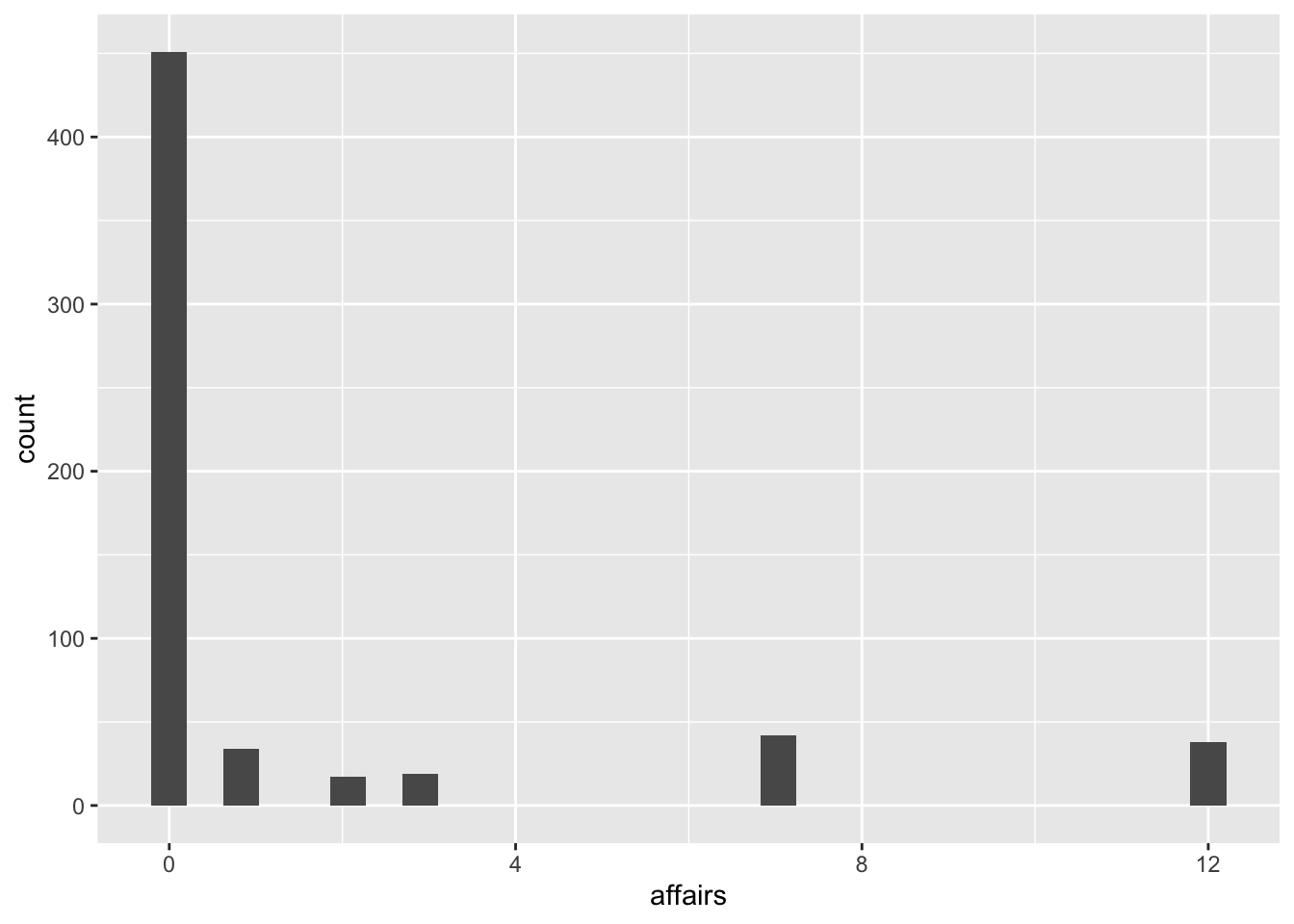
It’s not the most visually pleasing chart, but it allows us to see that the vast majority of people had 0 affairs (as we saw in the previous chart), then most people had fewer than 5 affairs, and there are a few isolated cases with 6 and 12 affairs. We can narrow the gap in the number of affairs by adjusting the bar width:
ggplot(affairs, aes(x = affairs))+
  geom_histogram(binwidth = 3)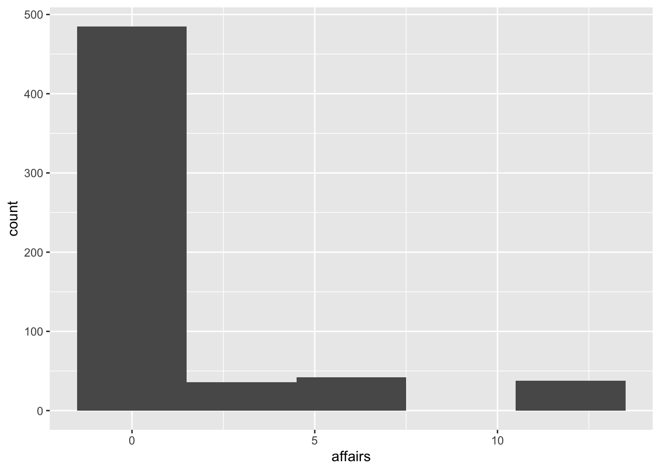
The decision about the bar width is also a methodological one: is it the same, in terms of research, for a person who had 0 affairs and someone who had 1 or 2? If the research were, for example, about marital fidelity, we might say it’s not the same. Still, if it were about compulsions or sex addiction, these situations might not be so different (compared to those who had 6 or 12 affairs).
For this chart, the aesthetic improvements are the same as for the previous one: color, axis labels, variable names, and values.
These two charts, the bar chart and the histogram, serve to analyze a single variable based on its counts. But perhaps our research is about identifying if there are differences in the number of affairs between men and women; in that case, we are already crossing two variables.
Question 3: Are there differences in the number of affairs between men and women?
This question has two ways to answer: we can think in terms of total counts or calculate averages by gender. Each option has its advantages and disadvantages. If we look at total counts, we find that this dataset has 315 responses from women and 286 from men. Therefore, total counts can be misleading: it may appear that the number of affairs for women is much higher than for men just because there are more female subjects.
We can address this issue by creating a histogram but separating the bars by gender using different colors:
ggplot(affairs, aes(x = affairs, fill = gender))+
  geom_histogram(binwidth = 2, position = "identity", alpha = .6)
It’s not the prettiest chart in the world (and not the most informative either), but there are several important things here. The first difference from the previous histogram is that we identify a color with gender (fill = gender); the second is that we allow for overlap (position = "identity") and the third is that we specify a significant degree of transparency to see that overlap (alpha = .6). We can see that there are more women than men who had 0-1 affairs, slightly more men who had 2-3 affairs, slightly more women who had 5-6 affairs, and also around 12 affairs. However, remember that there are many more female responses than male responses, so we need to know if this difference is proportional or not. This is where the possibility of looking at averages comes into play.
ggplot(affairs, aes(x = gender, y = affairs))+
  geom_point(stat = "summary", fun = "mean")+
  stat_summary(fun.data = "mean_se", geom = "errorbar",
               width = .2)
Here we have a bit more information: men have an average of 1.5 affairs, while women have slightly more than 1.4. However, both groups have a wide variability. This can also be seen with another chart, the boxplot:
ggplot(affairs, aes(x = gender, y = affairs))+
  geom_boxplot()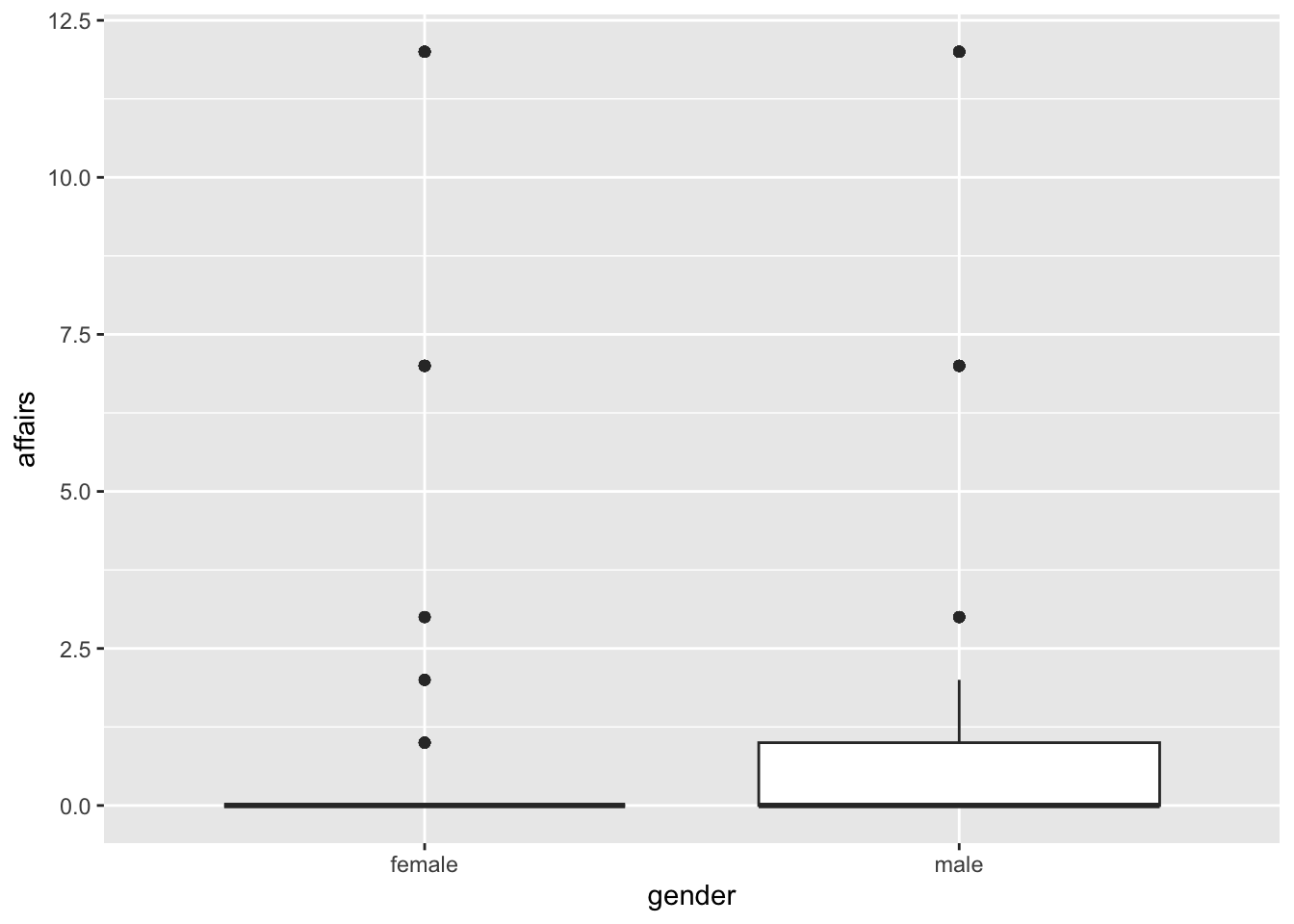
It might seem like the chart is poorly made, doesn’t it? But the truth is that it’s fine. The problem is that the boxplot mainly analyzes the median of the data and how they are distributed around it. Therefore, since our dataset has many responses with 0 affairs, the median is distorted. What we can do is calculate this chart only for responses that had affairs:
affairs %>%
  filter(affairs > 0) %>%
  ggplot(aes(x = gender, y = affairs))+
  geom_boxplot()
Now it’s accurate. In fact, this chart shows us that the median number of affairs is higher for women than for men, the opposite of what we found in our mean chart. This is because at that time, we hadn’t realized the effect of the 0 affairs responses (and remember that means are very sensitive to extreme values). So, I invite you to redo that chart by selecting only those responses that had affairs.
So far, we’ve been analyzing one and two variables, and we can incorporate a third:
Question 4: How many affairs did people have in different levels of religiosity, broken down by gender?
Here, we need to consider which variable should be on the X-axis, which should be on the Y-axis, and which will be the grouping variable (i.e., the third variable). Let’s revisit the mean chart, with religiosity on the X-axis and gender as the grouping variable:
ggplot(affairs, aes(x = religiousness, y = affairs, color = gender))+
   geom_point(stat = "summary", fun = "mean", position = position_dodge(.5))+
   stat_summary(fun.data = "mean_se", geom = "errorbar",
                width = .2, position = position_dodge(.5))
This can also be done with the other categorical or ordinal grouping variables in the dataset, such as age, years married, education, occupation. And we’ll see how to add a fourth variable to this chart:
Question 5: Do differences in the number of affairs between men and women of different religiosity levels remain when we separate them into those with children and those without?
There are several ways to incorporate four variables into a single chart (for example, a scatter plot with colors for gender and point shape for the difference in children), but they may become difficult to read. In these cases, my suggestion is to separate the charts into facets, which are called facet charts.
ggplot(affairs, aes(x = religiousness, y = affairs, color = gender))+
   geom_point(stat = "summary", fun = "mean", position = position_dodge(.5))+
   stat_summary(fun.data = "mean_se", geom = "errorbar",
                width = .2, position = position_dodge(.5))+
  facet_wrap(~children)
This can be done with any categorical variable, but it’s generally preferable to use variables with few levels (here we have only two: yes/no), because if we create many facets, there may be too few data in each. We could even reverse the gender and children:
ggplot(affairs, aes(x = religiousness, y = affairs, color = children))+
   geom_point(stat = "summary", fun = "mean", position = position_dodge(.5))+
   stat_summary(fun.data = "mean_se", geom = "errorbar",
                width = .2, position = position_dodge(.5))+
  facet_wrap(~gender)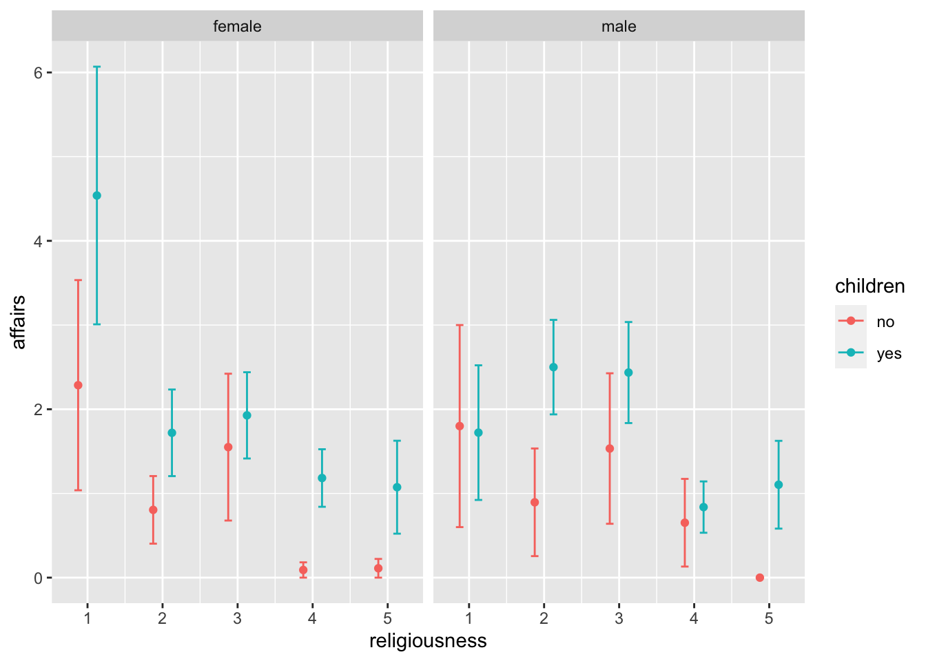
The information is the same, but it may serve, depending on our research, to think about different types of questions. These charts could be improved by adding reference text (titles, axes) and a table that explains the meaning of each religiousness level (you could change the level names on the X-axis, but that might be too crowded).
Conclusion
We have seen some research questions and the associated charts. We used charts as exploratory tools to start understanding the data and proposed ways to improve the clarity of the information. You can explore other variables to create the same charts.
As always, remember that you can subscribe to my blog to stay updated, and if you have any questions, feel free to contact me. If you like what I do, you can buy me a coffee from Argentina or a kofi from other countries. ```
Macarena Quiroga
Linguist/PhD student
I research language acquisition. I’m looking to deepen my knowledge of statistis and data science with R/Rstudio. If you like what I do, you can buy me a coffee from Argentina, or a kofi from other countries. Suscribe to my blog here.